Designing Web Apps For Multiple Devices
Originally appeared on the Mozilla Hacks blog
Before 2010, there were few devices on the Web other than smartphones and desktop/laptop computers. Developers could assume phone users had a small screen, low bandwidth and used a webapp for brief moments. Desktop users were assumed to have a large screen, high bandwidth and spend large amounts of time within an application.
Designing a webapp now means designing for 2014 and beyond, where users buy giant phones, phablets and tablets in many sizes. 4G connections may be faster than DSL or the throttled Wi-Fi at a coffee-shop. A number of laptop and “all-in-one” computers have touchscreens. Users may spend an evening hour on the couch with a tablet. And it was never true that all desktop users wanted apps to take up their whole screen – writing an e-mail or report often requires consulting another app, which ought to be content with half the screen.
Segmenting users by device today typically leads to bad assumptions for large minorities. Users use multiple devices throughout the day and dislike learning different interaction patterns for different devices. Apple’s “Back to the Mac” initiative sought to bring smartphone features to OS X, and Windows 8 and Ubuntu Unity strive to have a single experience from phones to desktops.
App examples #
It is difficult to achieve a good user experience for all devices and screen sizes, as seen by the criticism of Windows 8 and Apple's “Back to the Mac” initiative. It can be done for a range of devices, especially by new apps unburdened by legacy expectations. I present here two web apps optimized for smartphones through desktops (but not “smart” TVs, feature phones nor smartwatches): a photo gallery and a memo app.
Photo gallery #
The photo gallery is half of a photo sharing app. A sample album of the gallery can be seen online. (The application described as a whole is worth seeing.)
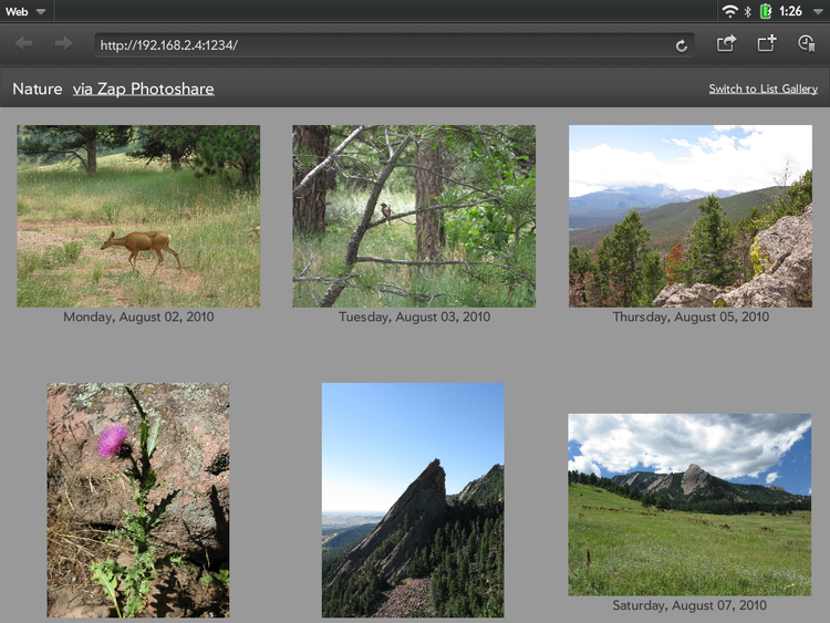
The photo gallery follows the paradigm used by a number of prior photo browsing apps. Thumbnails are presented in a grid which scrolls vertically. The number and width of columns depends on the screen width. Grid cells could be small or large; I chose the minimum cell size to be the smallest common screen width for smartphones: 320 CSS pixels. Thus, the number of columns is floor(windowWidth / 320) and the cell size is windowWidth / number of columns. Columns normally are from 320 to 639 pixels wide.
| Window Width | # Columns | Typical Device |
|---|---|---|
| 320-639 | 1 | phone/phablet (portrait) |
| 640-959 | 2 | phablet (landscape), tablet (portrait) |
| 960-1279 | 3 | tablet (landscape) |
| 1280- | 4 | laptop, desktop |
The number of columns is capped at four, so scrolling doesn’t outpace data transfer.
One approach would use fixed size thumbnails of 300×300 and increase the padding as cells get larger. However, the image library available (libjpeg) only supports half-, quarter- and eighth-size reductions, so padding is fixed and images are resized to fill. The web app requests a photo of appropriate size and the server (written in node.js, and normally running on a phone) returns the smallest version of the photo that fills the requested size cell.
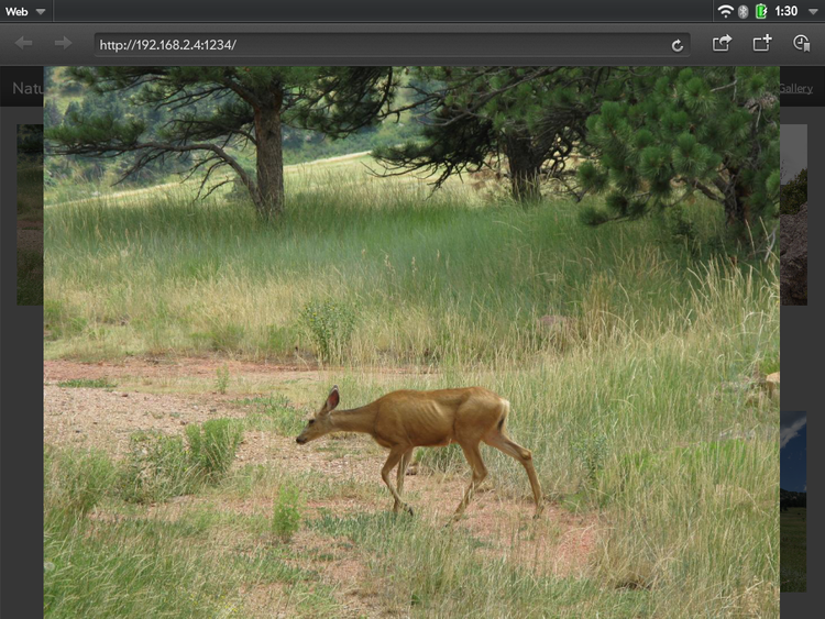
Tapping on a thumbnail switches to a carousel which fills the window. The user can zoom in further by double-tapping the image or using the mousewheel. Originally, full-screen mode was engaged when the carousel was displayed; however, changing to full-screen takes several seconds on many devices, so now full-screen mode must be manually set. Touchscreen users can swipe to navigate forward and backward, while desktop users can use the keyboard. A weakness is that a mouse user can click on a picture to navigate forward, but must swipe (or use the keyboard) to navigate backward. Mouse users could benefit from visible navigation buttons, but mice aren’t easy for a web app to detect.
Switching modes from the thumbnail gallery to the carousel and back is easy on any device. This supports the typical scenario of: user skims thumbnails to photo of interest, taps to enlarge, uses carousel to go through related photos, and returns to thumbnails. Users can navigate a substantial number of photos the same way on any device. A larger screen is shows more thumbnails at once and more detail on individual photos, but interaction is the same.
Development was eased by creative use of the List widget of Enyo 2 (though any list widget could have been used). Application code sizes the cells and fills each row with 1-4 thumbnails, while the List widget handles creating and re-using DOM elements. The carousel is Enyo’s ImageCarousel, which is designed from the ground up to run well on multiple types of devices.
Memo app (Serene Notes) #
The second example is a deceptively simple memo app, which can be used on-line or installed on Firefox OS from the Marketplace.
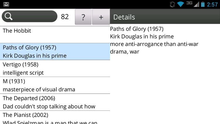
The fundamental layout is two panels side-by-side. In windows narrower than 640 CSS pixels, the second panel slides in on top of the first. Collapse is based solely on window width, not device class, so phablet users will have one column in portrait mode and two columns in landscape mode.
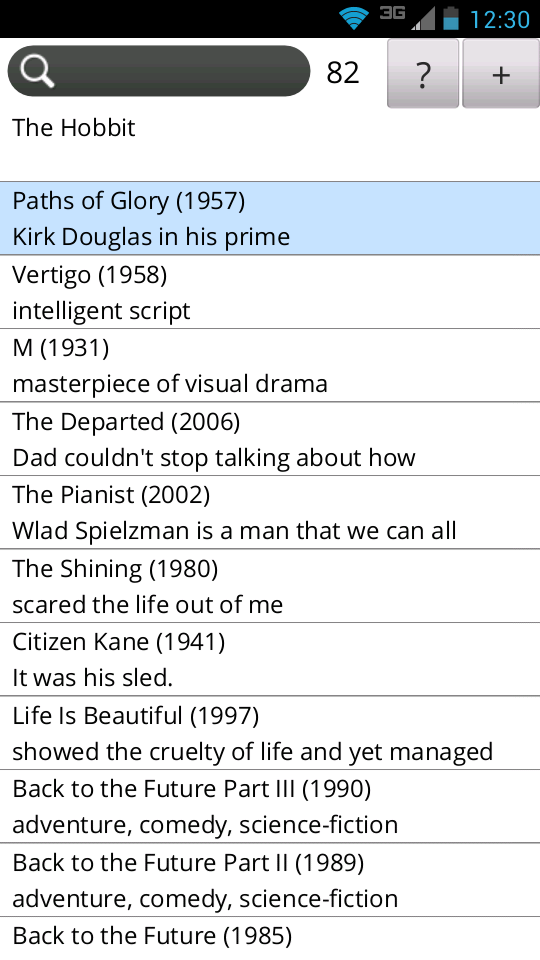
Tablet and desktop users don’t need to muck with dialogs or layers, while phone users have fast transitions. Most importantly, the shift in mental models is easy when going from a phone to a larger device. While this app does not currently sync user data between devices, adding that would give a seamless experience across devices. [The successor app Notes Together does sync between devices.]
Presently, the Help pane displaces the Details pane. In windows wider than 960px, Help should really be a third panel.
The collapsing panels use the Enyo Panels widget. Another instance of Panels is used to swap the Details and Help panes in the second panel. Using a JavaScript framework designed to support multiple devices really speeds development.
To maximize display of user data the list foregoes controls on items in favor of direct manipulation: items can be swiped (or double-clicked) for operations such as Delete. Reordering is done by hold-then-drag. Discoverability was traded off for power – many apps will need to strike a different balance. A possible future enhancement on larger screens would be to add visible controls or at least tool tips.
Fixed groupings such as folders or notebooks would require the user to navigate an extra level to access data. Search allows a memo to be in multiple groupings, and requires less UI. (However, it is not appropriate for users who rely on spatial memory.)
While typing on a touchscreen is laborious, the app minimizes typing by using prefix searches. Searching for “s fra” will find all memos that contain “San Francisco” and few false positives among hundreds of memos. The on-screen keyboard on most phones obscures all but a few list items, but live search and the counter of hits tells the user when she has narrowed the search to a handful of memos. Skimming the list then allows the user to select the desired record. Live full-text search is implemented using IndexedDB.
Typing is also minimized by localizing the search to the preferred language of the browser or OS. In Spanish ñ is a different letter than n (and Spanish keyboards have a key devoted to it), just as w is a different letter than u in English. For Spanish users, peña never matches pena, reducing false matches. However, users are not required to know languages other than their own, so for a Spanish user “cote” matches the French cote, coté, côte and côté.
Hardware keyboards allow users to type more quickly and accurately, larger screens minimize scrolling, and faster processors and disks make complicated searches nearly instantaneous, but the interface works the same for all devices.
Mobile first #
Both apps were designed “mobile-first”, which tends to result in lean apps, with fewer features than standard desktop apps. Given that most features in desktop apps are rarely used, that’s not necessarily a problem for desktop users. Carefully-chosen defaults eliminate the need for preference settings.
Working out a user interface design that works well across a range of devices often requires more effort initially, but can result in a more user-friendly experience with the added benefit of being easier to maintain. A few powerful user-interface elements can eliminate the need for many panes, dialogs, dropdowns and buttons.
- Previous: webOS “Desk Accessories”
- Next: Buying OS X Lion Online